


Packaging plays a key role in helping you stand out with the growing competition around you. Brands need to market, brand, attract, and enhance their product all at the same time.
A well-designed package can serve you all these things and create a memorable experience among your target audience. After all, with the world cluttered with competitors, it makes sense to use different colors in your packaging to capture your audience’s attention.
Choosing the right design is one of the important things, and so is choosing the right color. Color tells a lot about your brand. That means packaging should be attractive and create an emotional impact on your ideal audience.
Color can evoke emotions, create associations, and influence your customers' buying decisions. In fact, 95% of purchasing decisions are influenced by emotions.
The color in your packaging is more than just attractive; it immediately engages your audience emotionally. Emotions are what really drives decision and purchasing behaviors. And color increases brand recognition by 80%.
For example, Burger King uses Orange in their packaging. It shows the sense of fun and friendliness significantly changes the overall look and feel of the packaging.

Another example is Starbucks which uses green color to show they are working towards making their products more sustainable and eco-friendly.

Let’s understand the role of Colors in packaging design, but before that, let’s talk about why Color psychology is important in packaging.
Color psychology studies colors to determine how colors affect human behavior. Color evokes feelings and emotions, and choosing the right colors for your marketing efforts can help you stand out.
Using color strategically can enhance your brand perception, but what more does it do?
Colors not only evoke feelings but connect with humans emotionally. For example, warm colors like red and orange create a sense of urgency, while cool colors like green and blue can convey calmness and trust.
Colors can establish a brand identity. Consistent use of specific colors in packaging creates visual associations and enhances brand recognition. For example, iconic brands like Tiffany & Co. use a distinctive blue color that is easily recognizable.
In a crowded market, packaging colors can help your brand and product stand out from the competitors. Using vibrant and eye-catching colors can grab customers' eyes and draw their attention to the shelf.
Colors can create certain product attributes or qualities. For example, bright colors often used on children’s toys or snacks convey a sense of fun and grab their attention.
Let’s talk about the box packaging and the factors affecting its design.
A box packaging design refers to designing packaging that is visually appealing and functional for your product in the form of boxes. A well-designed box packaging design can make a huge difference in helping you stand out.
Before you start designing, make sure you know about your product and target audience. Different types of box packaging designs can be used as per the product and functionality.
Here are a few types of Box Packaging Designs used -
A unique design can help you stand out and make your product more appealing to the target audience. Here are some key elements that affect your box packaging design:
Now let’s discuss the role of different colors and the steps to choose the perfect color for your Box packaging design.
Different colors have different meanings and emotions attached to them. Choosing the right one that resonates with your brand can be an add-on for your marketing & branding efforts.
Here is the list of what different colors represent :
Red is associated with excitement, passion, danger, energy, and action. You might have noticed that it provokes a sense of excitement to draw attention to products. Brands like Coca-Cola often use it for their branding.

The color Orange represents creativity, enthusiasm, warmth, and playfulness. For example, Fanta uses orange to enhance flavor association, capture attention, and convey energy and positivity.

Green is associated with nature, growth, freshness, health, and sustainability. For example, Subway uses green packaging to convey the perception of their fresh food, their commitment to reducing environmental impact, and promoting sustainable practices.

The color blue is often described as trust, quiet, and reliability. For example, Pepsi, the regular can, has a blue background. The blue color points to the idea of loyalty and security of the brand, as it's been around for a long time in the market.

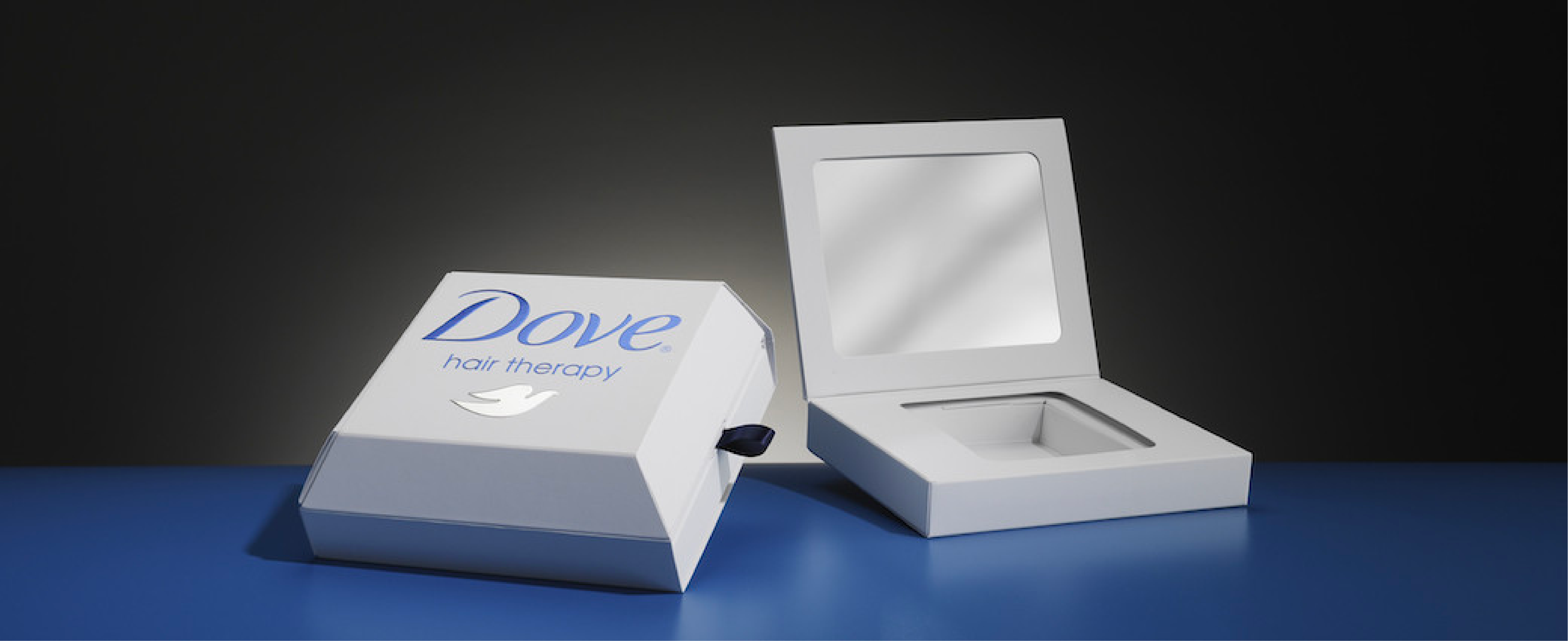
White color is often associated with cleanliness, purity, and simplicity. Just like Dove, which uses white in packaging to refer to the brand's origin and contribution to evoke purity and simplicity. In addition, it also reminds the basic concept that “the product contains ¼ of milk.”
Black is a luxurious color that shows sophistication, elegance, authority, and mystery. Like Algorithm, a coffee-producing brand, uses black packaging and purple elements to grab customers' eyes.

Color yellow drives the customers' emotions like happiness, optimism, and joy. Just like the Maggi, a 2-minute instant noodle recipe.

These common packaging colors brands use to create emotional attachments with their customers. But how do you choose the color that suits your brand? How do you select colors that boost your branding and marketing efforts?
Let’s dive into our step-by-step process that helps you to select the perfect color.
Selecting the perfect color for your packaging involves carefully considering several factors, from brand personality to understanding the audience and environmental factors.
Here are key steps to consider when selecting color for packaging:

1. Understanding the Brand: The first step is understanding the brand's identity, values, and personality. In addition, consider the brand guidelines, mission, vision, and visual elements associated with the brand.
2. Target Audience: Once you understand your brand, next is to gain insights about your target audience, and determine their demographics, preferences, and characteristics. Remember, different colors evoke different emotions and have cultural associations, so select the color that resonates with them.
3. Research Color Psychology: Once you know your brand and target audience, get familiarized with color psychology and the meanings of different colors. Colors can elicit specific emotions and perceptions (check the above section for the role of different colors).
4. Consider Industry Standards, Trends, and Competitors: Along with the color psychology, analyze the packaging designs and color palettes your competitors use within your industry/niche. While it’s important to stand out from competitors, it’s crucial to understand industry norms or find different ways to differentiate yourself and avoid potential conflicts.
5. Identify the Product’s Attributes: Don’t forget the product features, benefits, and unique selling points that can help you stand out from competitors. Consider the emotions or values you want to convey through your packaging, such as building trust, eco-friendliness, luxury, excitement, or energy.
6. Consider Color Harmony and Contrast: It’s also crucial to select colors that harmonize with each element in your packaging design and brand. Create visual balance using color harmony, like complementary, analogous, and triadic colors. In addition, the contract colors can help you draw your customers' attention and highlight key information on the packaging.
7. Packaging Material and Finishing: The last step to selection is to consider how the selected color interacts with the packaging material and finish. Some colors might appear differently when using different printing methods and materials, so test the colors and consult the experts to ensure you achieve the desired result.
8. Test and Iterate: Before finalizing the colors, create mockups and experiment with color combinations that align with the brand, target audience, and product attributes. In addition, create digital representations of packaging designs to visualize how colors interact and evoke emotions among your customers.
9. Conduct Consumer Research: Once you have decided on a certain color and design, it’s time to know its impact on your Target audience. Gather feedback from focus groups, target customers, or industry experts to gain in-depth insights into the colors. It can help you make informed decisions, and collecting valuable feedback can let you know how consumers perceive the color options.
10. Adaptability and Versatility: Consider the flexibility of the color scheme across different product variations or future product lines. Plan your colors for seasonal or limited-edition packaging by incorporating colors that can be easily swapped and adjusted to accommodate future branding or other seasonal needs.
Now that you have learned what color psychology is and what each color means, it’s time to apply them in your packaging design. The right color can help you stand out from competitors and shelves, so brands must use the right hue.
Make sure the color you select improves factors like brand identity, differentiating from competitors, connecting emotionally with your audience, and telling more about your brand and product.
Our creative and experienced team helps brands choose the right color and design for their box packaging. We help you to choose colors that can help you improve branding, marketing, and awareness and attract the right audience.
Let’s connect & discuss more.
